 Screenwipe
If I were to be supremely condemnatory, I’d go so far as to describe the screenshot as almost entirely irrelevant. Next to a newly-released "artist’s rendition" of the new Nintendo console and Take 2’s expertly crafted fiascos, there’s nothing quite so effective in throwing our video gaming selves into a flurry of judgemental internet-based frothing. Be it in support or, more often, anger, saliva and screenshots play a crucial part in our very initial commentary on the latest news. I don’t think I’m being unreasonable when I ask "why?"
You could argue that they present expecting excitables with a more definitive definition of the game, a form in which they could take the hyperbole and sometimes excessive floral detailing of previews and press releases into a single designation – pictures say a thousand words or something. They allow you to forge a more concise interpretation of the game’s atmosphere that could never really be justified in literary terms. Just one of the many inadequacies of the lineal medium, author Harlan Ellison would oft-complain and I agree. Just how many words would it take to literate a thousand pictures?
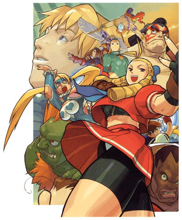
But that’s what the promotional art is for. Often more impressive, elaborate, more revealing of the tone and palette, more demonstrative of the characters without the restrictions of polygons and in-game angles which are never viewed when you’re actually playing the game, more creative with the gimmicks and features of the title than a checklist and a montage of the same sprite in different colours, just this pure distilled expression of what the game is about. You only need to look at Akihiko Yoshida’s awe-inspiring cover art for Vagrant Story or the elegant melodrama of the Castlevania artwork. Screenshots will never be able to compete. If you want straight information on the game, if you want to know how it will play, how you’ll feel when you’re gripping the joypad between your digits with eyes focused solely on the screen in front then what better source than interviews with the creators? To be able to gather the information straight from the horse’s mouth without the unavoidable and sometimes unnoticeable alterations your verbose publications will employ. If Yoshinori Ono says Street Fighter 4 will be more orientated towards attacking then defence then chances are it will be. You’ll learn more through the man’s horse-mouth words than the in-game facial expressions between Ryu and Ken. Screenshots will never be able to compete.
Or so they shouldn’t but they do. We lust after them like hungry pack wolves, huddled together in the bleakest and brightest corridors of the internet, waiting impatiently at every announcement or arranged event, journalists live-blogging with hunched obsessives bathed in the flickering glow of their monitors clicking the ‘refresh’ button every half-second for that first stealing glimpse. And we’re always playing Goldilocks, that glimpse is always too hot or too cold, there’s always an issue with the detailing of the laser beam (Halo 3) or the re-use of GBA sprites (Final Fantasy Tactics A2) or complaining about the complete change in art direction (Legend of Zelda: Wind Waker). And we’re near always wrong – Halo 3 was in beta at the time and now looks incredible, Tactics A2 does not re-use GBA sprites and looks incredible and Wind Waker is now remembered as one of the most visually charming titles in the series and looks incredible.
A screenshot is not news, there is very little to feast on after the dust has settled and flamboyant raging arguments have subsided until you realise, dust down, you’ve been mauling each other over very little meat indeed while the cunning bugger in the corner’s merrily chomping on Kojima’s announcement that Metal Gear Solid 4 has dirty magazines in it. No one looks back and says "oh, didn’t that screenshot look just dreamy?" No, we look back and furiously masturbate over Yoshida’s perfectly pornographic paintwork or raise a glass to celebrate that Phantom Hourglass looks just like Wind Waker. That’s how it should be from the start. That is what we should be able to recognise and appreciate, to discuss and debate without tripping into pitfalls left for us in the form of mildly pretty (or not) stills, without the need or desire to desperately detail every ridiculous aspect of a product which will look entirely different when in motion.
18 December, 2007
Katie
Subscribe to:
Post Comments (Atom)

No comments:
Post a Comment